


Primo
Rebrand the nation's leading smallgoods meat brand to uphold its title and elevate it to the next level as a meaningful food brand.
Primo
- Brand Strategy
- Brand Identity
- Packaging Design
- Communications
Established in 1985, Primo reigns supreme as Australia's premier smallgoods producer, earning a reputation for the nations favourite ham and bacon. However, as culture evolves and attitudes towards processed meats shift, Primo now stands at the brink of a new challenge. Tasked with revitalizing the brand and its extensive portfolio, we strived to ensure Primo retains its title as the market leader while venturing into uncharted product territories.
The Challenge
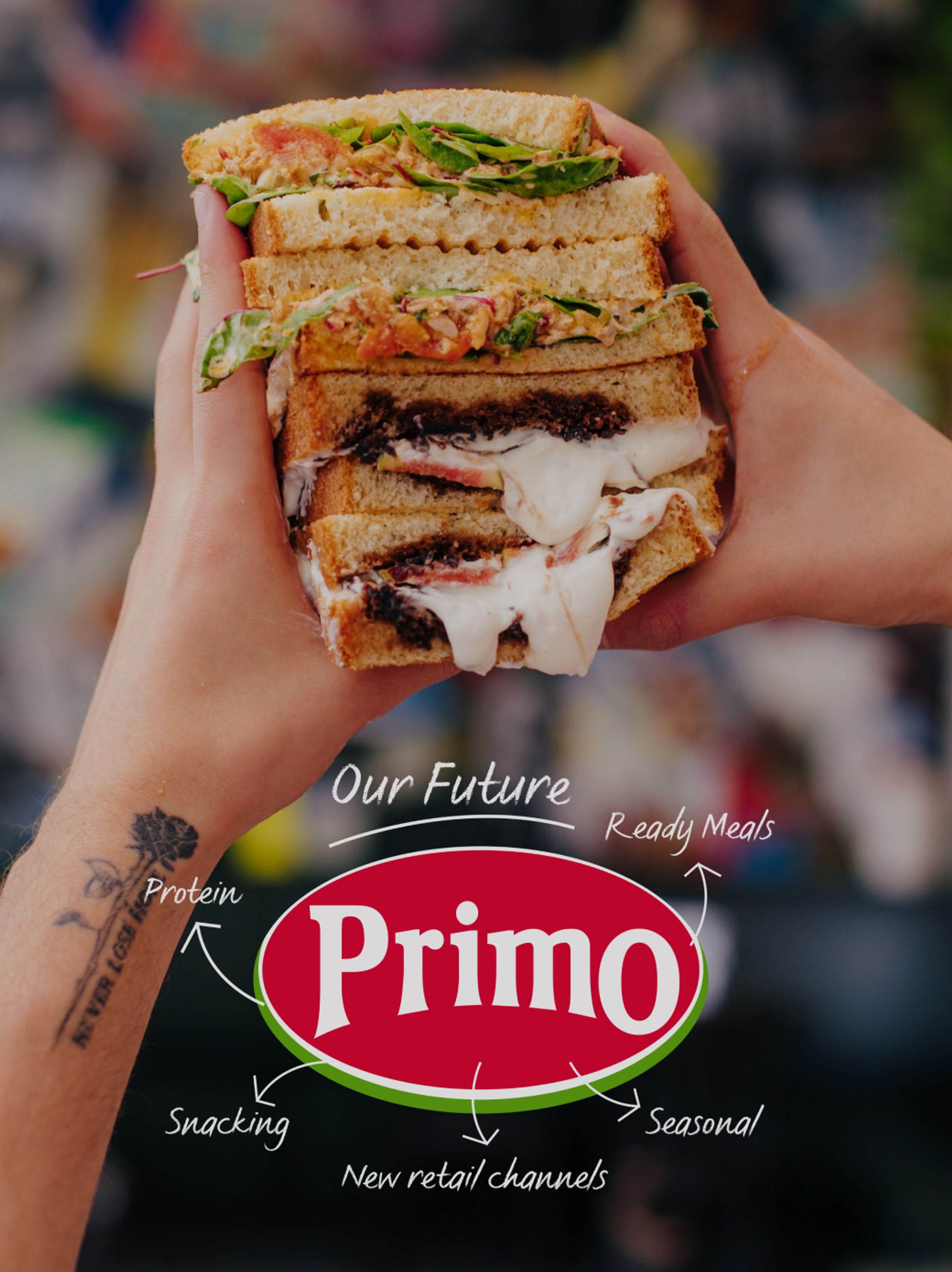
Entrusted with helping shape the future of Primo, Our Revolution eagerly embraced the challenge. Primo was poised for transformation - from a mere supplier to a beloved and purposeful food brand. To achieve this, a fresh strategic direction was required, coupled with a revitalised master brand identity and a dynamic suite of packaging designs. These elements would ignite Primo's expansion into new product innovations and categories, propelling the brand to new heights.

The Solution
Guiding the Primo Marketing Team through transformative workshops, we united internal stakeholders with a newly crafted strategic vision. By combining research and insights, we were able to craft a blueprint that truly reflected Primo's reason for existence, its unique and own-able idea at its heart, and its distinct set of beliefs.
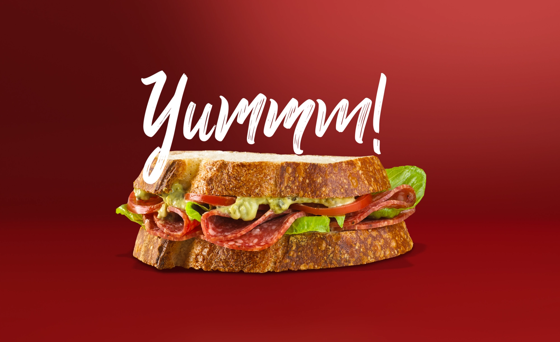
Without ham life is justa sandwich missingits soulmate
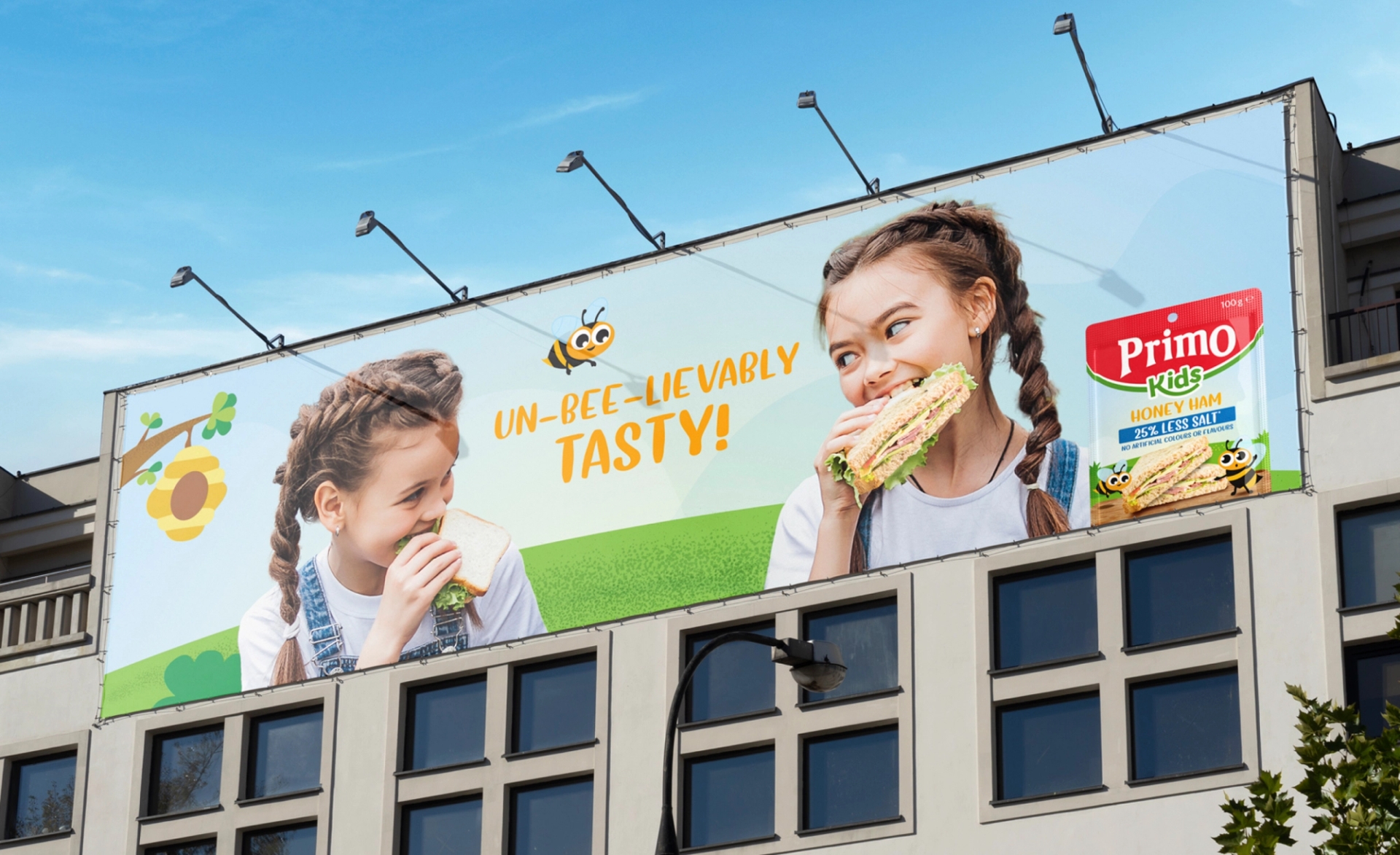
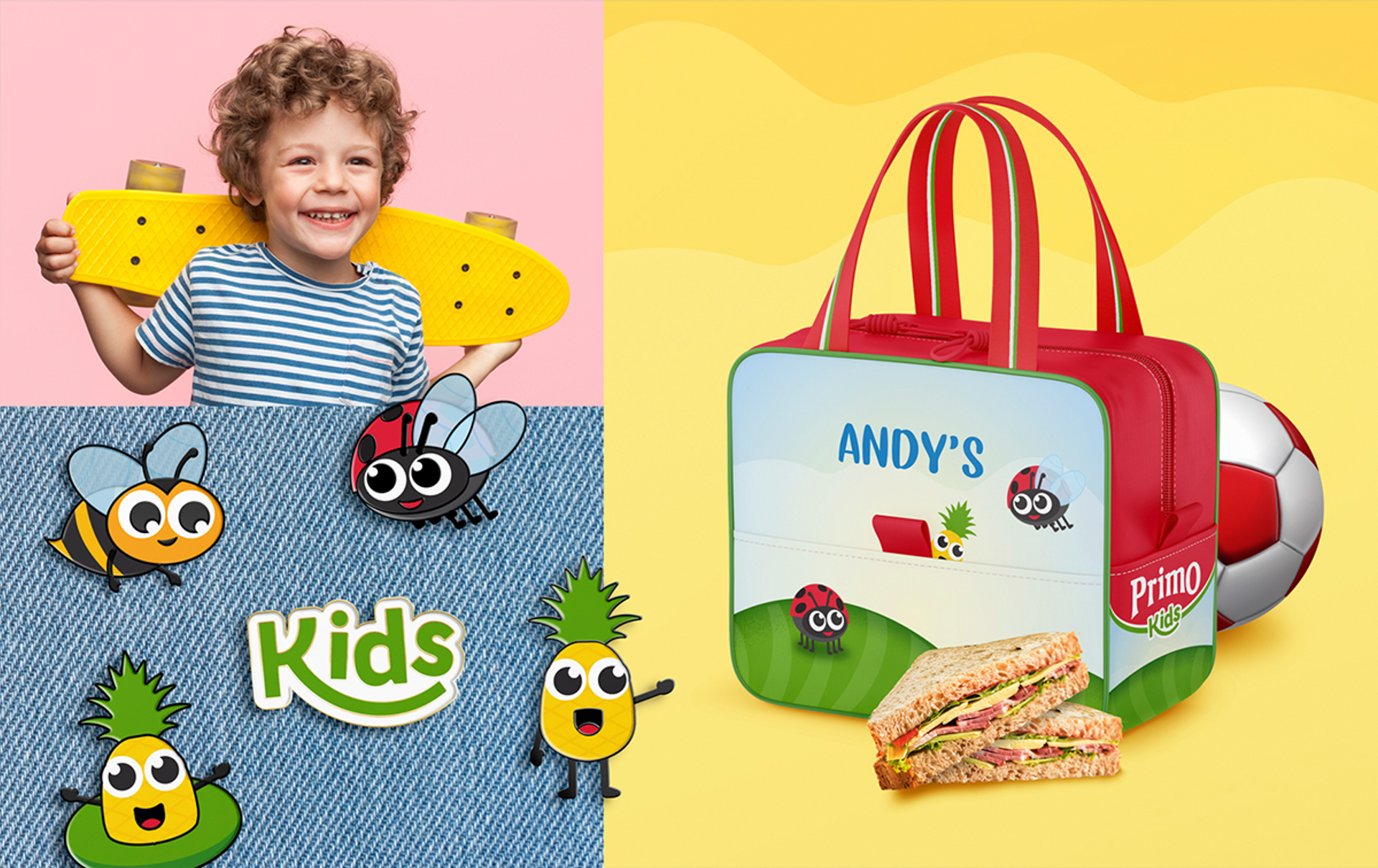
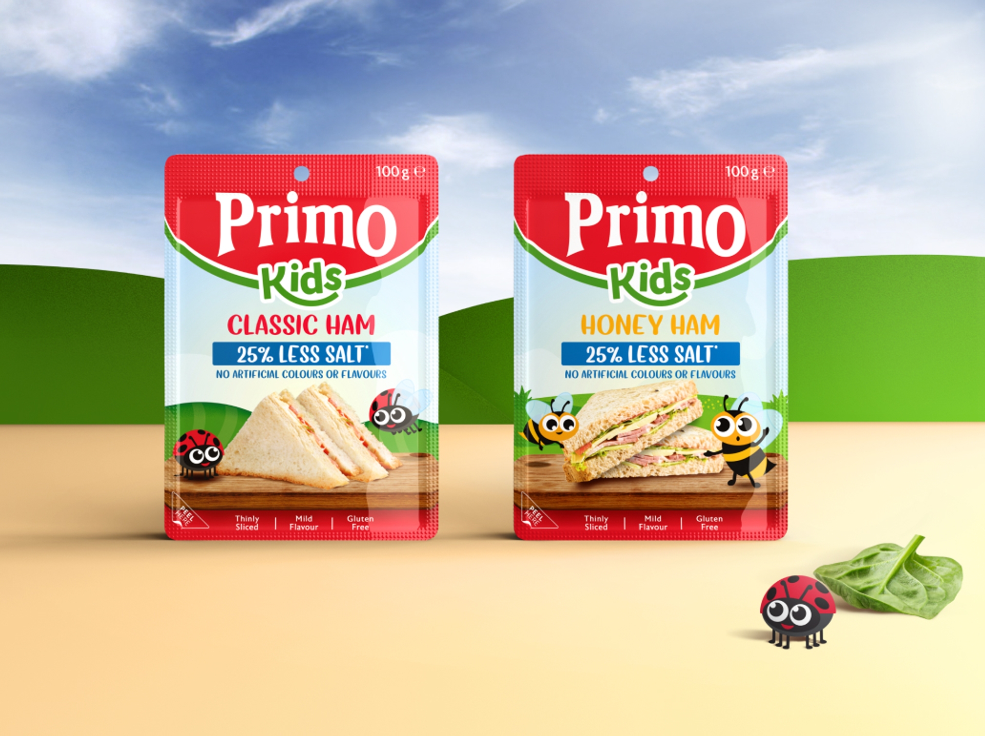
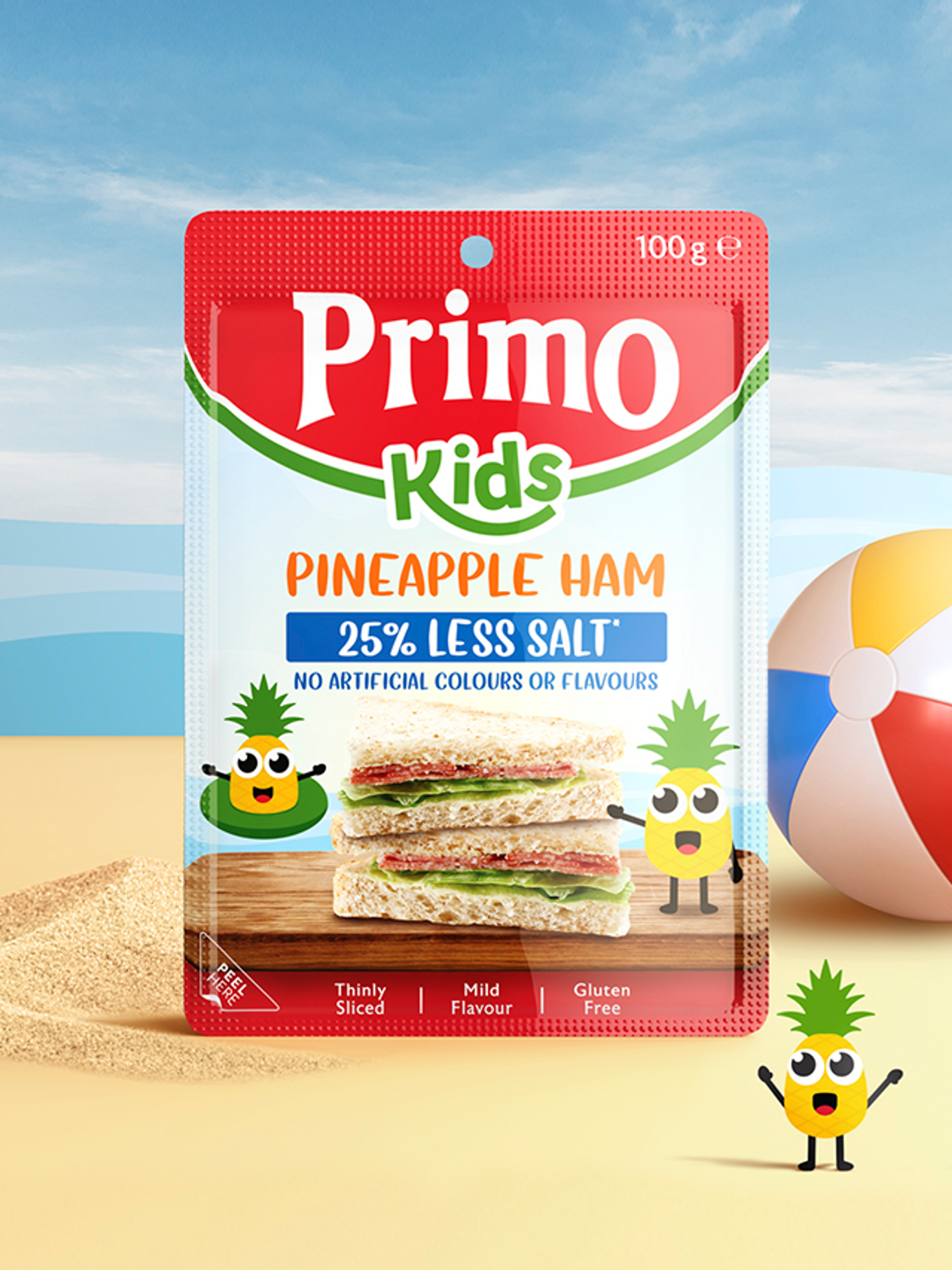
The brand refresh infused a sense of togetherness and impact across the range and categories.
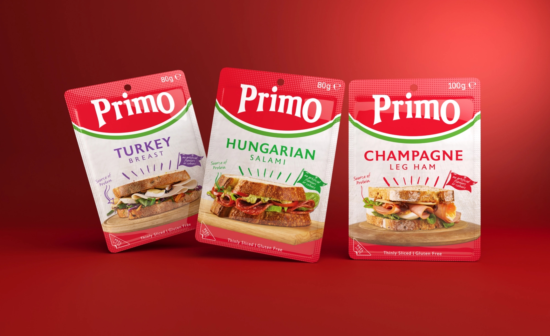
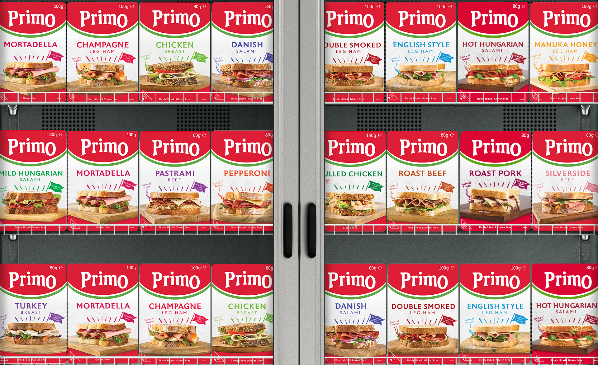
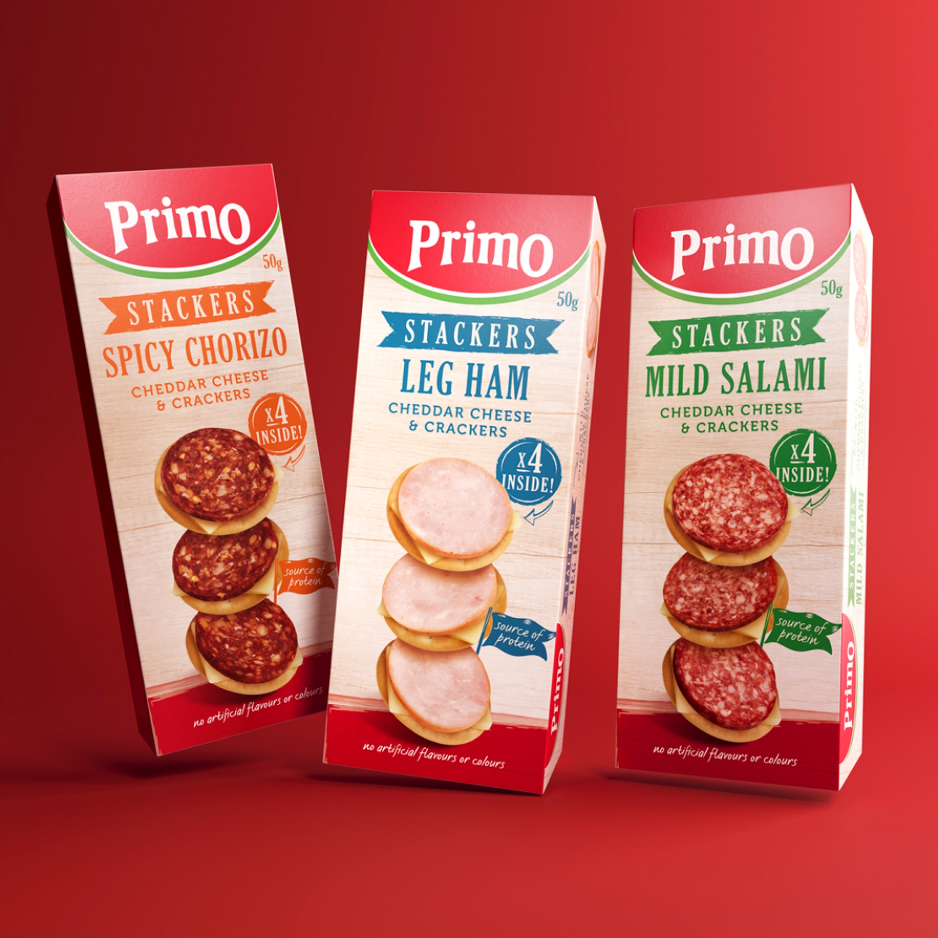
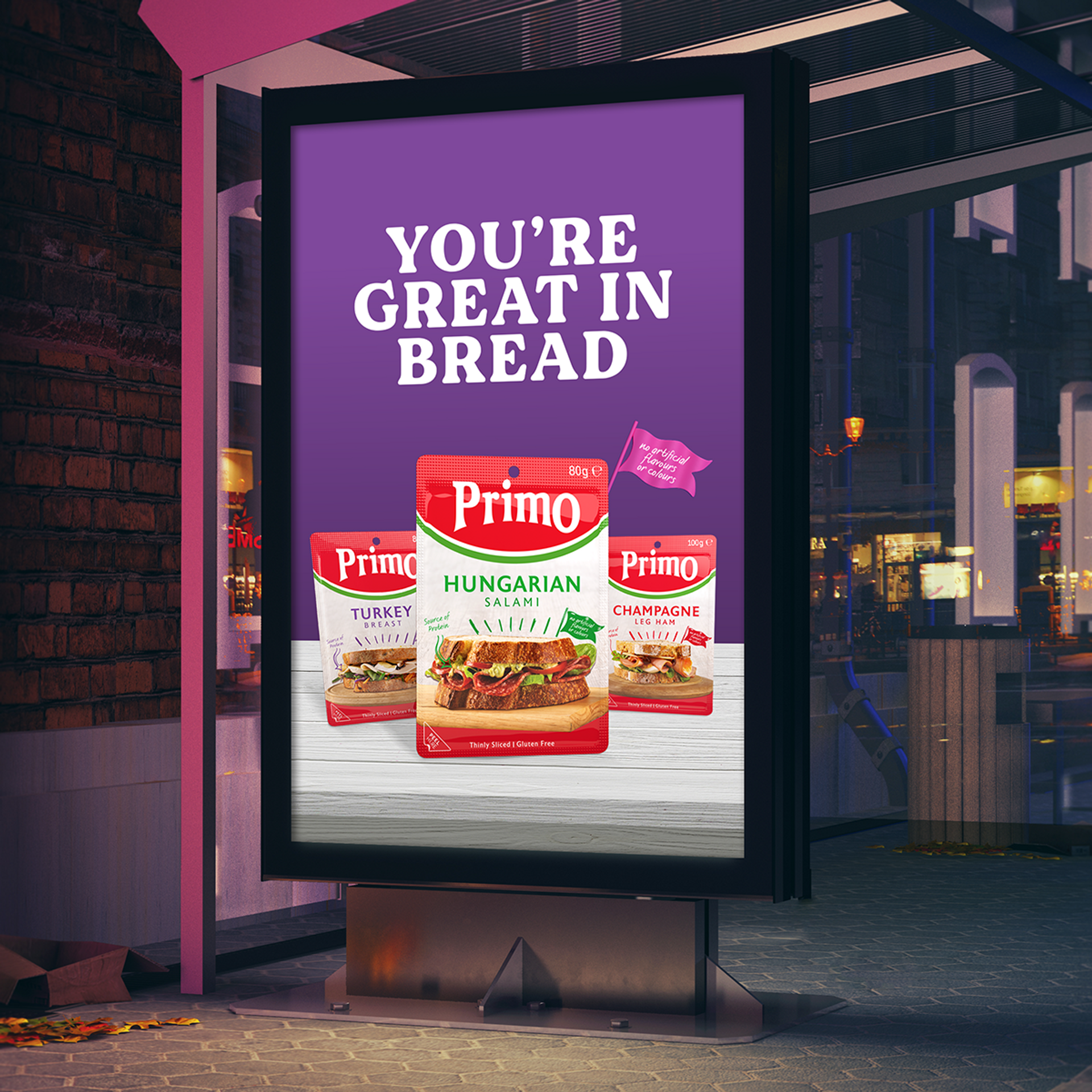
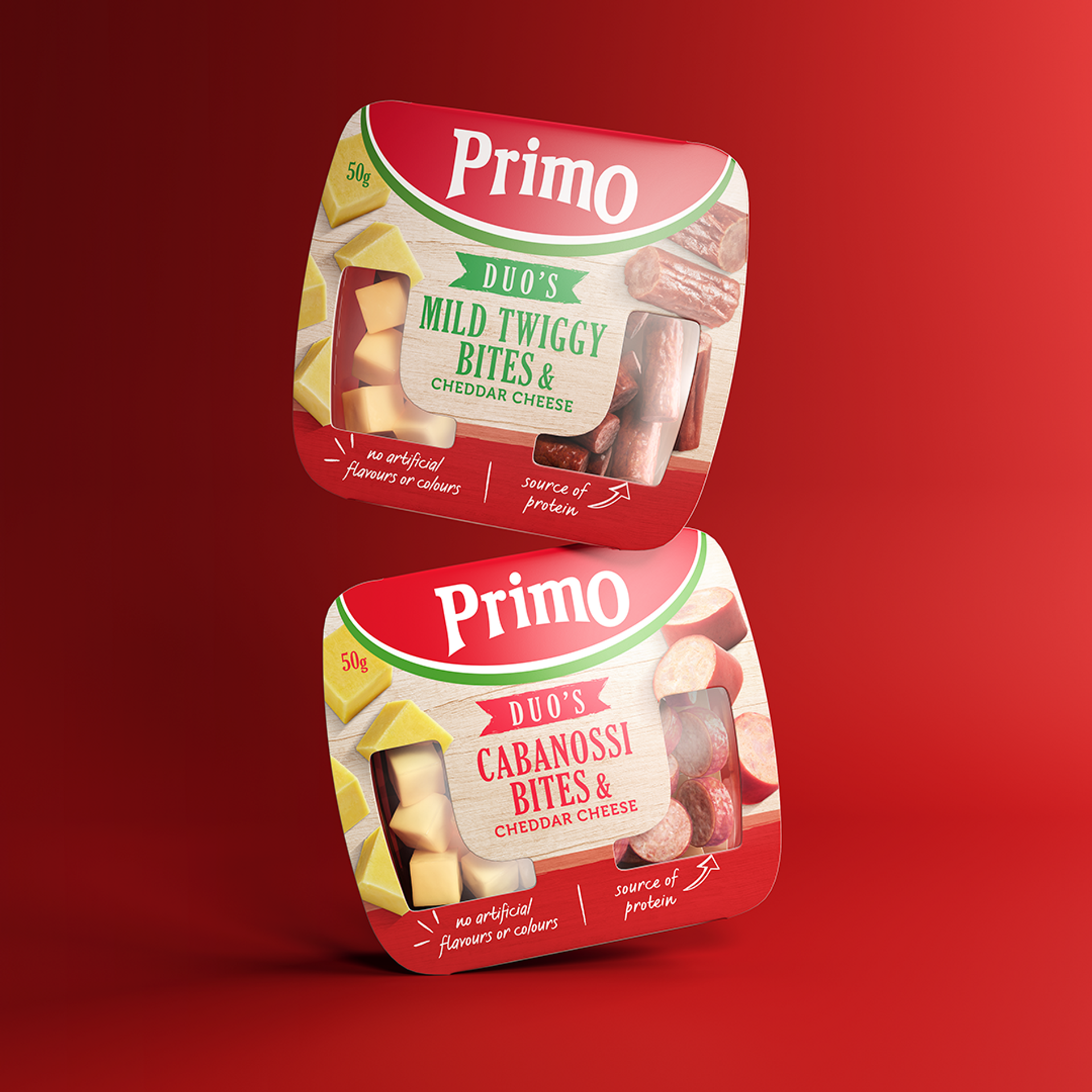
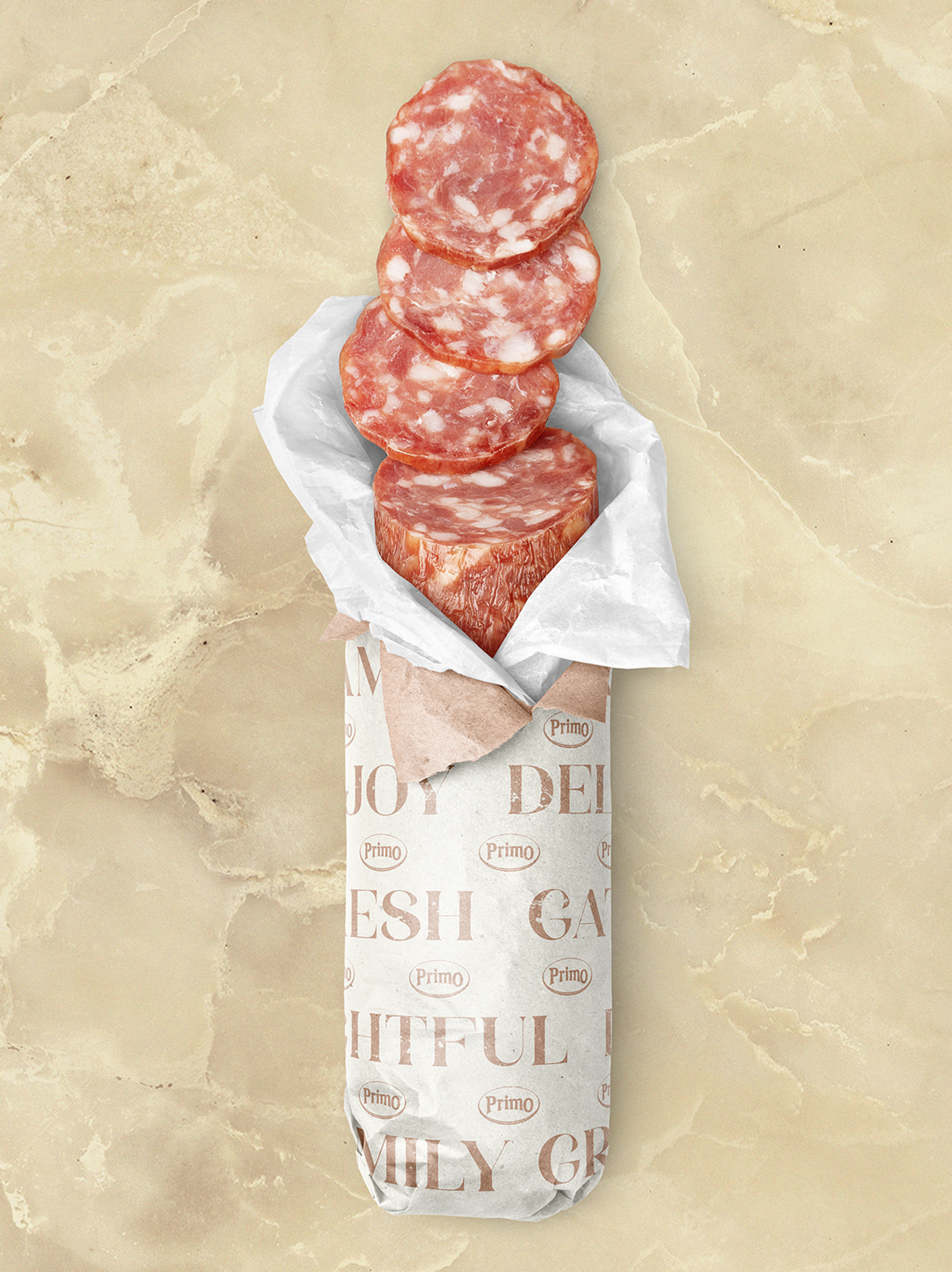
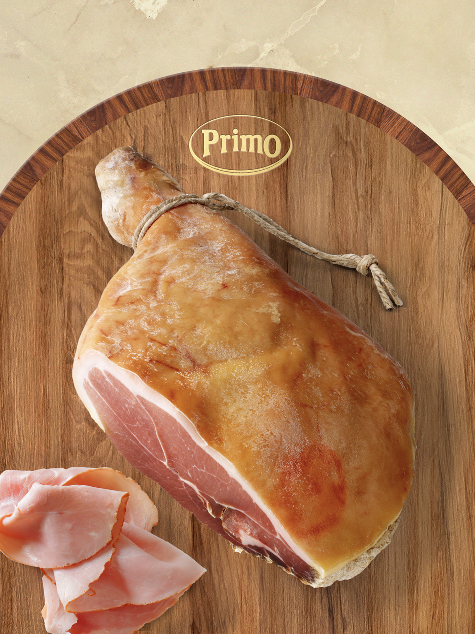
Breathing new life into the Primo identity, we unleashed its potential for diversification into new categories, all while preserving its well-deserved title as Australia's premier smallgoods brand. Our brand refresh created a sense of unity across a growing range of offerings, with a distinct look and feel that solidified Primo's recognition and reputation. We imbued a simple, yet powerful, design strategy across the core product line, simplifying variant navigation and elevating the overall offering. The revitalized packaging architecture opened the door to new product innovations, allowing for seamless introductions to market. The brand and packaging makeover were reinforced with steadfast guidelines, ensuring consistent and impactful communication.
We brought new life to successful product expansions, with sub-brand identities and impactful creative communications.
Contact us
Let's chat about your brand...
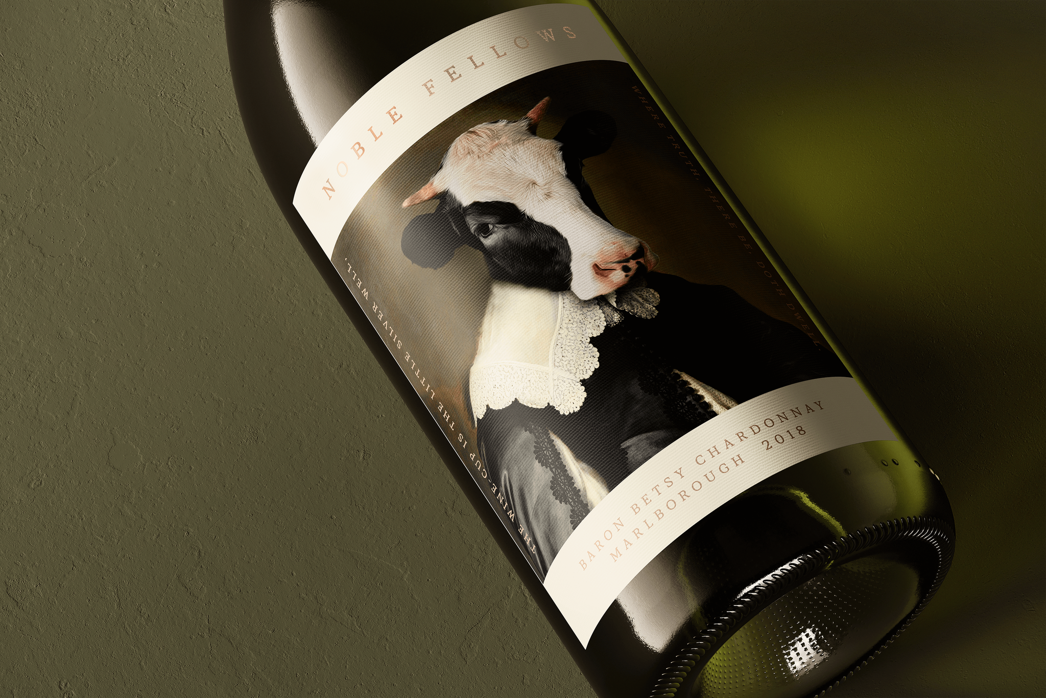
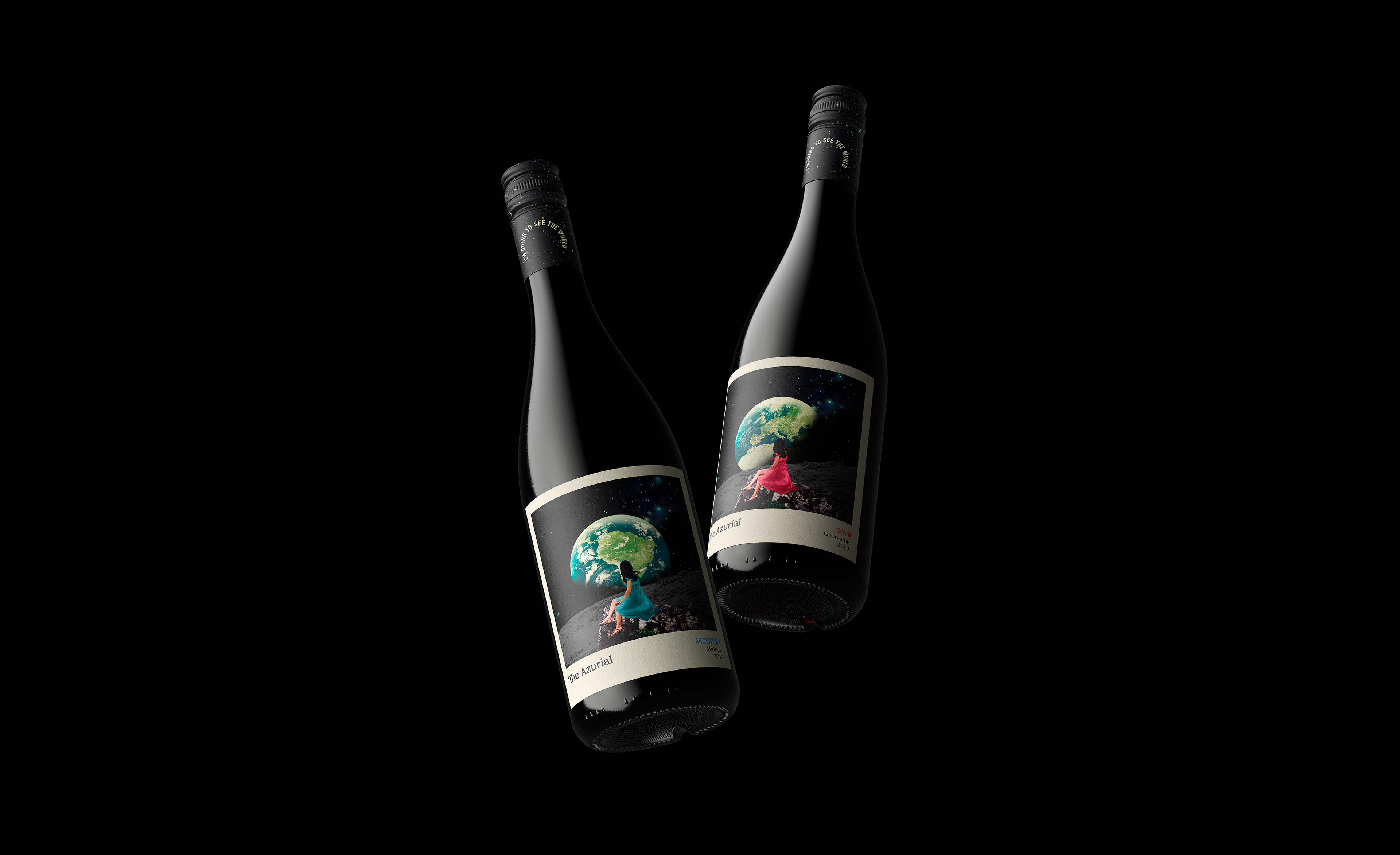
The Azurial
Exploring further and farther to discover a new perspective for a global wine range.
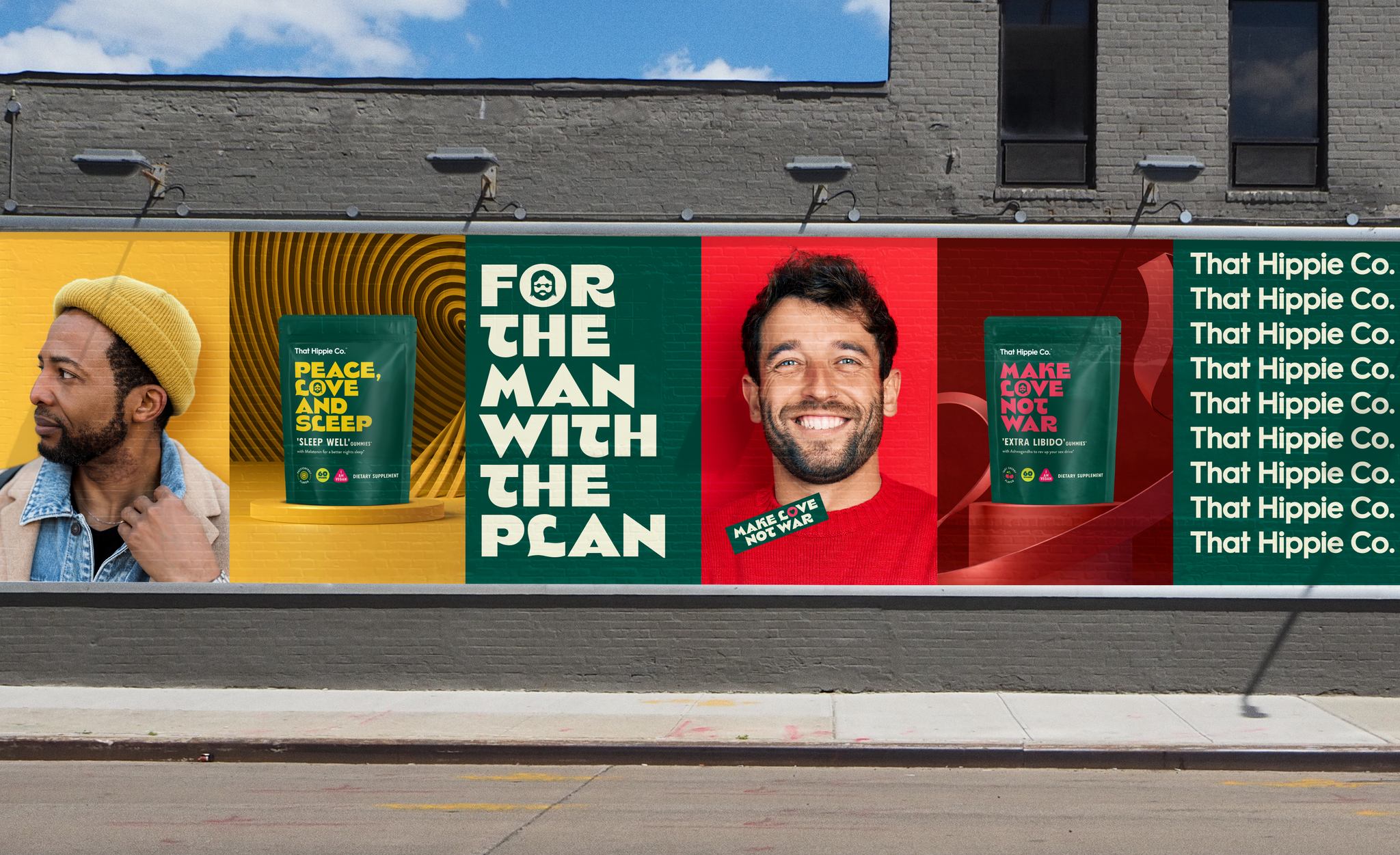
That Hippie Co.
Bringing light relief to the world of self-care for men through a range of supplement gummies primed to take on the US market.
The Azurial
Exploring further and farther to discover a new perspective for a global wine range.